What are Japanese Candlesticks charts?
Traders use many tools to help them predict the direction of the market. Japanese candlestick is one such tool that most traders rely on to better understand the price direction.
What are Japanese Candlesticks charts?
Candlesticks were historically used by Japanese traders for technical analysis in the rice trade, way back in 17th century. After modifications and refinement over a century, the candlesticks are now used to understand price movements in the stock market.
While the technology and sources have changed, the principle of the candlesticks stays the same. It is as applicable to the stock market as they were to the price of rice in the 17th century.
The basic principles of the candlesticks are as follows.
- The price action is more important the cause (ie earnings, news, loss etc)
- Price reflects all the known information about the product.
- The price movement is based on the expectations and emotions of the participants, i.e. buyers and sellers.
- There is always a fluctuation in the market
- The price of a product may not accurately show its underlying value.
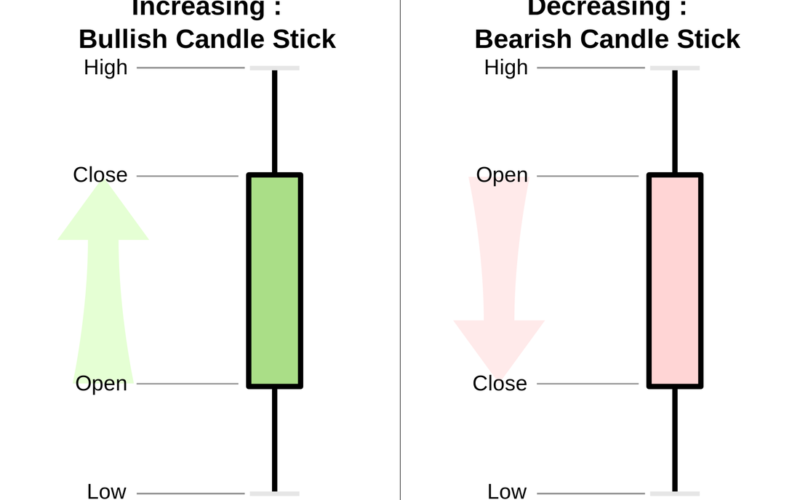
The candlesticks comprises of four components, open, close, low and high values for a particular period. You can choose to read the hourly (or even 15 minutes), daily, weekly or monthly charts based on the type of information you are looking for.

Here is how you read the individual candlesticks.
When the Body of the chart is black (as above) or red, it means the stock closed lower than the opening price. A white (or green) body indicates the price closed higher than the opening.
The size of the body (rectangle in the above pic) is the time duration. i.e. if your chart is a one-hour chart, each body will show the opening and closing price for that hour. The line at the top of the body (wick) shows the highest and the one at the bottom, the lowest price reached during the time – In this example, in one hour.
Reading the candlesticks chart
If the Upper wick of the filled in (black or red) body is short, it means the opening price of the day was close to the highest price of the day.
If the upper wick is short on top of an empty (i.e. white or green) body, this indicates that the closing price was the high of the day.

Assume this chart represents a 30-day price movement, and each candle represents one day.
Point 1 is a green body with a long wick, this means that the price closed higher than the opening of the day. The long wick indicates that the high of the day was not the closing price.
Point 2 is that the low of that day was not the closing price.
Point 3 is a case where the closing price was lower than the opening price (red coloured) for the day. The long wick at the end also means that the low price was lower than the closing price for that day.
Point 4 indicates that the low of the day was also the opening price of the day.
Advantages of the candlestick charts
A Simple line chart or a complex bar chart can be used to plot the price movements for any stock. However, a line chart cannot convey the amount of information as a bar chart. They are also easier to interpret than a bar chart.
You can visually identify the buy and sell points with ease. A cluster of hollow blocks (or green) indicates a heightened buying pressure and a cluster of black blocks (or red) show selling pressures.
A man should look for what is, and not for what he thinks should be. – Albert Einstein
A good trader looks at the chart to find out ‘what it is’ instead of what he wants it to be. The candlesticks do a fantastic job in helping us figure out buying/selling pressures in the market. Use it to your advantage when you are conducting a technical analysis of a stock. Try to vary your duration to see if you can get a better insight in the price action. Day traders could go down from a minute to hourly price actions, while an investor would track a 30 day or a quarter’s price action.
Most of the stocks brokers/websites will give you access to free charting tools. You can also check out http://www.livecharts.co.uk/ to draw your charts.